


Every Death Counts, Not Just COVID Deaths
Every Death Counts, Not Just COVID Deaths
Canada's 2020 mortality in perspective
Throughout 2020, state epidemiologist Anders Tegnell, in charge of Sweden's moderate response to the SARS-CoV-2 pandemic, kept pointing to the longterm collateral damage caused by lockdowns and saying that the year-end excess mortality would be the earliest metric to assess the success or failure of the "Swedish model", as compared to what we might call the "Chinese model" based on the origin of lockdown measures. Many a lockdown skeptic has been waiting for the annual mortality statistics, only to find out that even something as seemingly straightforward as recording deaths isn't without challenges and delays, and moreover that the concept of "excess mortality" is anything but definitive.
Let's examine mortality trends for Canada. Most of the data sources and graphs included here were inspired by Twitter user @Milhouse_Van_Ho, who has prepared and shared series of COVID-19 statistics for Toronto, Ontario, Quebec, and all of Canada since April 2020, and whose contributions to an evidence-based discussion of the virus threat and suitable response measures I want to gratefully acknowledge. Statistics Canada wrote about "Excess mortality in Canada during the COVID-19 pandemic" in August 2020, explaining that measuring excess mortality requires an accurate death count as well as "some way to determine the number of deaths that would be expected to be observed were there no pandemic". Without giving details, they suggest that Canada is using an estimate that takes longer-term trends into account. And, "In the Canadian context, with an aging and growing population, the number of deaths has been steadily increasing over recent years and so a higher number of deaths in 2020 would be expected regardless of COVID-19."

Let's have a look at these trends. As of the initial draft of this post on 20 March 2021, Statistics Canada's 2020 mortality data are almost complete, missing only the toll for the last week of December. From 2010 to 2019, annual death counts (shown as the bars in both of the above graphs) have risen by 50,000 from 234,425 to 283,155. Importantly, in all but one of those years (2012), the death count has grown from the previous year, so simply comparing a year's mortality to that of the previous year cannot be interpreted as "excess". The 2012 decline was -1.2%, and the 2019 value was nearly stable at +0.1%, while the "usual" growth has been in the order of +2.1% to +2.7% each year with an outlier of +5.8% in 2011. The current death count for 2020 stands at 296,370, which corresponds to a 4.7% increase over 2019. Extending the linear trendline (grey) included in the above graphs would lead to around 295,000 as the expected death count for the year 2020.
The death rate per 1,000 residents (shown as the black line and using the right-hand axis in both graphs above) is also increasing in most years. The exceptions are 2012 and 2019. This can be important because lower-than-expected mortality in one year can lead to higher mortality in the following year(s). This refers to the "dry tinder" effect, where e.g. a mild flu cycle or a mild summer can see fragile people, who might have passed away during the year under normal circumstances, survive into the following year, thus increasing that year's mortality. The reason for showing two graphs for the same data is to illustrate how charts can emphasize trends or the lack thereof. The graph on the right, which looks as if nearly no changes have happened over the ten years 2010-2020, is meant to contextualize this decade within the 200-year time period shown in one of the following figures.
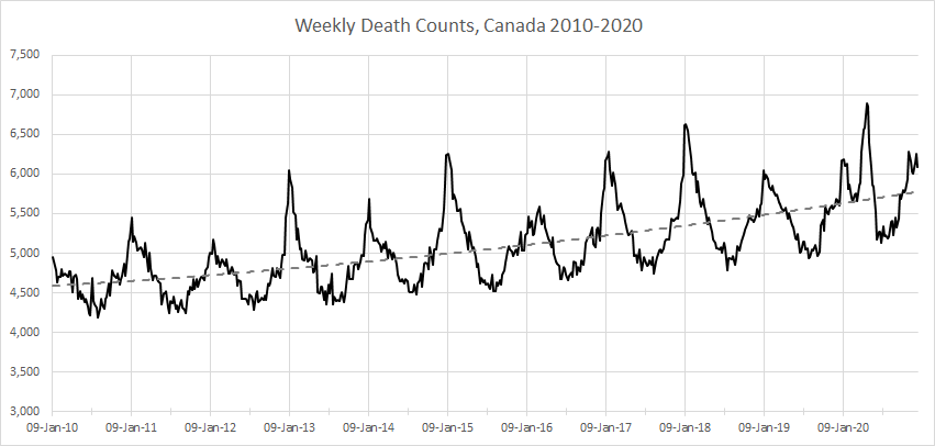
Another view of Canada's death counts is by week. The weekly death counts show strong variation between as few as 4,750 deaths in some weeks during the last three summers pre-2020 and peaks between 6,050 and 6,630. Interestingly, the pattern is very consistent with the winter peaks occurring in the first week of January almost every year 2010-2019, with 2020 being the only clear exception with a higher peak in late April in conjunction with COVID-19. However, even that peak of 6,760 weekly deaths is less than 10% higher than the January 2020 peak at 6,185. The consistency of this seasonal pattern, of course, reflects the typical cycle of respiratory illness discussed in a previous blog post.
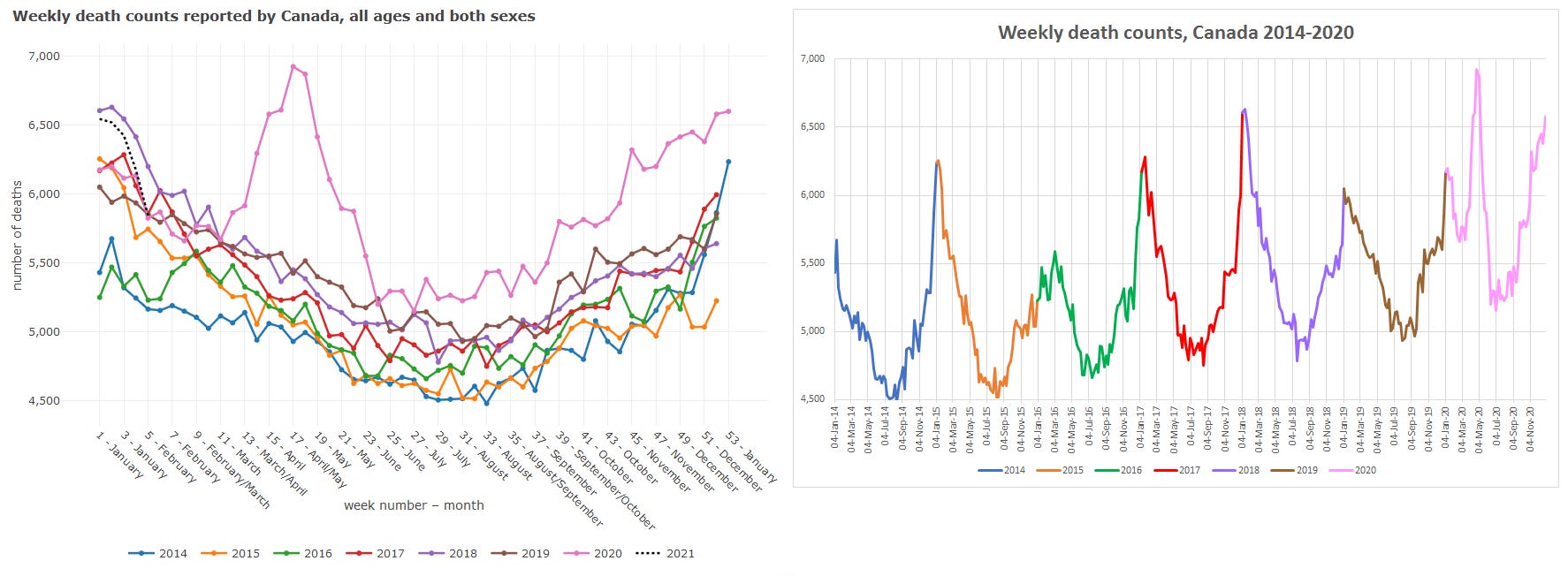
To hammer home the need for context and perspective, I am adding two graphs to the first version of this post. Statistics Canada has now (mid-May 2021) release “provisional” weekly death counts for the entire year 2020. The data table 13-10-0768-01 also contains historical data with the interactive data viewer going back to 2014. The tool shows the annual data in stacked formation, which emphasizes the position of the curve for 2020 at the top of most of the weekly stacks starting in week 12 (late March 2020). This chart is not wrong, but it hides important contextual information about the temporal trend leading up to 2020. An alternative visualization of the same data using the same colour coding for the years 2014-2020 and the same vertical axis is shown above besides the StatCan chart. The pink part of the curve representing 2020 now looks quite unexceptional in the context of a trend of cyclical, growing death counts. What is most striking is to see, as in the above 2010-2020 graph, the two low winter peaks for 2018/19 and 2019/20 (brown curve) preceding the SARS-CoV-2 pandemic, which may very well be the only explanation needed for the large number of vulnerable individuals who succumbed to COVID-19 in the early spring of 2020.

Further confirmation of the recent as well as anticipated further increase of Canada's mortality comes from a longer-term perspective. Due to population growth, the raw count of annual deaths has increased in most years since 1900. However, the normalized (relative) death rate per 1,000 Canadian residents has significantly declined from highs between 13 and 16 per 1,000 in 1900-1920 to lows around 6.8 per 1,000 in the early 1980s. Since then, the death rate is climbing again, most recently to 7.7 per 1,000 in 2019. The United Nations (via Macrotrends) expect Canada's death rate to rise above 8.0 within 5 years, above 9.0 within 15 years, and above 10.0 within 25 years, owing to the aging of the population. In conjunction with further population growth, Canada will have nearly half a million deaths per year by 2060, up from around 300,000 now.
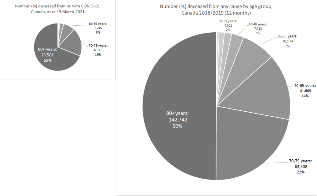
I do not regularly read or watch mainstream media and was honestly surprised to find out that Canada has only some 22,500 "COVID deaths" as of 19 March 2021. In 2018/19, there were almost 21,000 deaths in my cohort aged 50-59 years, a shocking 7% of the annual death count. In the 60-69 age group, about twice as many died from all causes as compared to the total COVID-19 death count. And the 70-79 age group counted roughly three times as many deaths as the cumulative COVID toll.
The age distribution of COVID-19 deaths is distinct with a major shift towards the older age groups. In Canada, almost 70% are 80 years or older, while all-cause mortality affects "only" 50% in the oldest age group. In other words, of those who pass away from or with COVID, more than two third have reached 80 years of age, while on average half of us die before reaching 80. This pronounced skew towards the elderly was known since the very beginning of the pandemic from China and then Italy, and is the basis for the concept of focused protection of vulnerable groups advocated by the signatories of the Great Barrington Declaration and by many global health experts, as the preferred alternative instead of quarantining healthy people.
The Public Health Agency of Canada also reports that 12,337 COVID-19 deaths were reported in longterm care homes and retirement residences as of the 13 March 2021 (Table 6 in Canada COVID-19 Weekly Epidemiology Report published 19 March 2021). While this accounts for "only" 55%, dramatically less than the over 80% reported in the spring of 2020 (e.g., "Canada’s proportion of coronavirus deaths in nursing homes top 16 other nations: study"), it further supports the focused protection argued by the Great Barrington Declaration and professional emergency managers such as Colonel David Redman.